sep 2026
strava engineering
the numbers on a strava activity look simple. 10.24 km. 5:12 /km. 87 m of elevation. behind each one is a noisy gps trace, a file parser, a smoothing pipeline, and a set of backend services that have to finish in a couple of seconds after you hit save. this is a walk through that machine, based on what strava has published in its engineering posts and help docs — not an official spec, just how the system actually behaves at scale.
the phone is a bad instrument
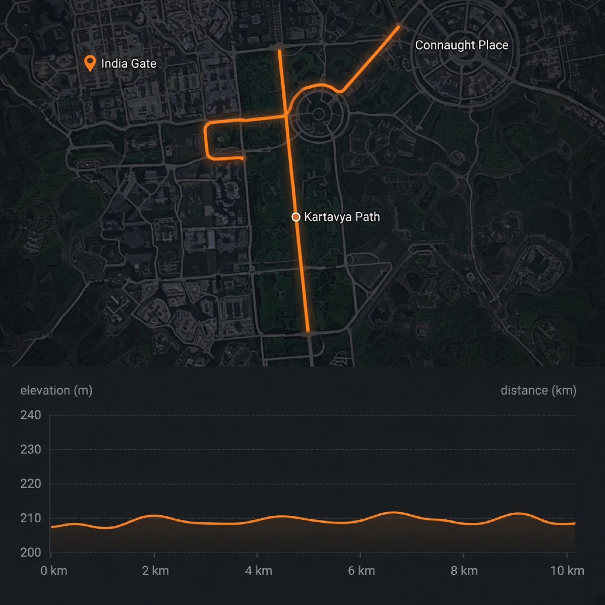
a consumer gps receiver is not a survey tool. under open sky it might land within 3–5 metres. between buildings, under trees, or in a canyon it wanders. the phone samples around once a second, sometimes less when the os throttles location to save battery. each sample is a latitude, a longitude, a timestamp, and often a junk altitude.
if you draw straight lines between those points you do not get the road. you get a drunk walk around the road. that walk is longer than the road. this is why two people on the same run can upload two different distances, and why a watch with a wheel or foot pod can disagree with the phone in your pocket. strava's whole activity pipeline exists to turn that drunk walk into something an athlete will trust.
what an activity actually is
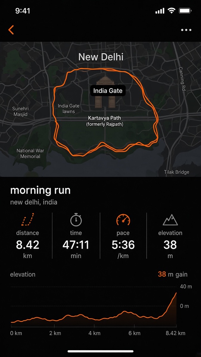
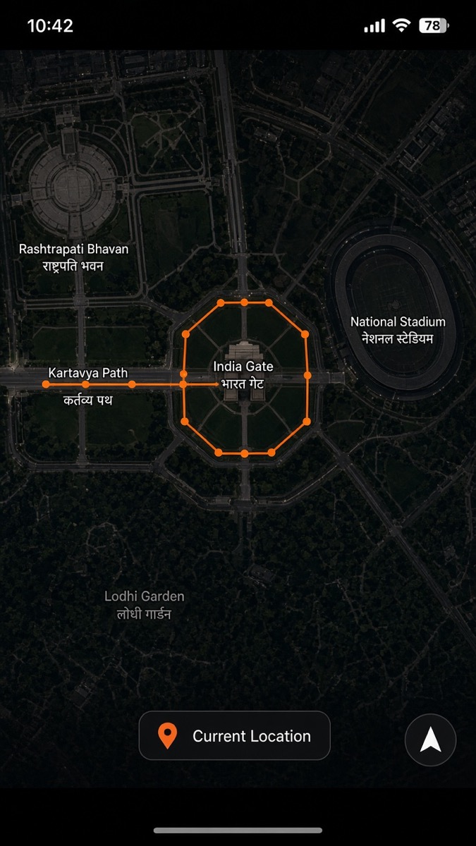
on disk, an activity is not a row with three numbers. it is a bundle of streams: time, latlng, altitude, distance, speed, heartrate, cadence, watts. strava has said this stream corpus ran past 150 tb and a billion activities, with each stream historically stored as a gzipped json array on s3. that layout is fine when a request needs one activity. it is a disaster when you want all of them — one get per file, expensive to list, expensive to inflate.
so the same data also lives in a spark data lake: parquet + snappy on s3, delta-encoded, packed into ~100 mb chunks. streams compress well because consecutive gps points barely move. that bulk path is what feeds the global heatmap, route builder, clustering, and grade-adjusted pace. the live path — the one that runs when you upload — is a different machine.
the upload
you finish a run. the app, or a garmin / wahoo / coros watch, posts a file. fit, gpx, or tcx. the public api is a multipart form post. strava does a cheap first pass: is the file parseable, is it a duplicate, does every trackpoint have a time. then it enqueues the file and returns an upload id. the activity is not in the feed yet.
processing is async. the docs tell developers to poll about once a second. mean time has been under two seconds. that number is the contract the rest of the company lives on: parse, clean, compute metrics, write the activity, emit events, and leave the heavy geo work (segments, flyby, grouping) to follow. an activity can be 'done' before every segment effort exists.
how distance is calculated
distance is the number people argue about. strava does not always recompute it from gps. many devices write their own distance stream into the file, sometimes using a wheel magnet, a foot pod, or the device's own filter. if that stream is present, strava prefers it, after dropping obvious outliers. that is why a turbo trainer or a bike computer with a speed sensor often matches the device screen.
if there is no device distance, strava sums point to point. each pair of latlngs is a geodesic on the wgs84 ellipsoid — in practice a haversine or vincenty step, not a flat pythagoras on raw degrees. add those steps and you have a path length. the catch is noise. a zig-zag around a straight road inflates the sum. a gps jump across a river adds a phantom kilometre. so the parser drops points that are inconsistent with time and the rest of the file: impossible speed, isolated spikes, clusters that are clearly drift.
there is a threshold. if too much of the track looks rotten, strava stops trusting a single source and blends gps distance with device distance over the bad regions. that reprocessed number can disagree with the watch, especially when a speed sensor and a jumpy gps are both in the file. two athletes on the same group ride can still land on different totals because their devices sampled differently, paused differently, or drifted on different sides of the road.
smoothing is the other half. you cannot keep every raw point. you also cannot simplify so hard that a switchback disappears. a typical approach in this industry is a speed-aware filter plus something like douglas-peucker for the polyline that actually gets drawn on a map. the stored stream stays denser than the map line. what you see on the activity page is a display geometry. what the backend uses for distance and segments is the cleaned stream.
pace, moving time, and speed
pace is not elapsed time divided by distance. if it were, every traffic light would make you slower. strava splits elapsed time and moving time. moving time is the clock with stops removed. pace for a run is moving time over distance. speed for a ride is distance over moving time. the same streams feed both.
stopped points have to be detected. a naive rule is 'speed below x'. that fails when gps jitters in place: you are standing still, the point jumps five metres, the filter thinks you jogged. so stop detection looks at a window — low speed, little net displacement, maybe a cadence or power sensor reading zero. those points still exist in the stream. they just do not add to moving time, and they should not add much to distance either.
splits and laps are the same math on a slice. a kilometre split is the time between the point where cumulative distance crossed n and the point where it crossed n+1. if distance was smoothed, splits move. if auto-pause ate thirty seconds at a water fountain, that split looks faster than the watch that kept the clock running. none of this is a bug. it is two different definitions of 'time'.
grade-adjusted pace is the next layer for runs. a 5:00 /km up a 6% grade is not the same effort as 5:00 on the flat. strava rebuilt gap using the bulk stream lake — looking at how pace actually changes with gradient across a huge population, then applying that model to your elevation stream. gap is not measured. it is inferred from pace plus grade, and grade comes from the elevation pipeline below.
gps, map matching, and the polyline
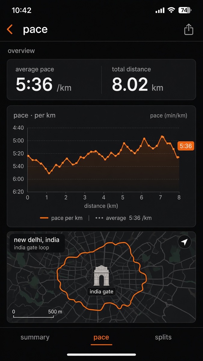
raw latlng is wgs84. maps are usually web mercator. somewhere in the pipeline the stream is projected, clipped, and encoded. the activity map you see is almost certainly a simplified polyline, often in google's encoded polyline format, not the full 1 hz trace. that is why zooming in on a city run still looks like a clean line on a street, while the underlying file is messier.
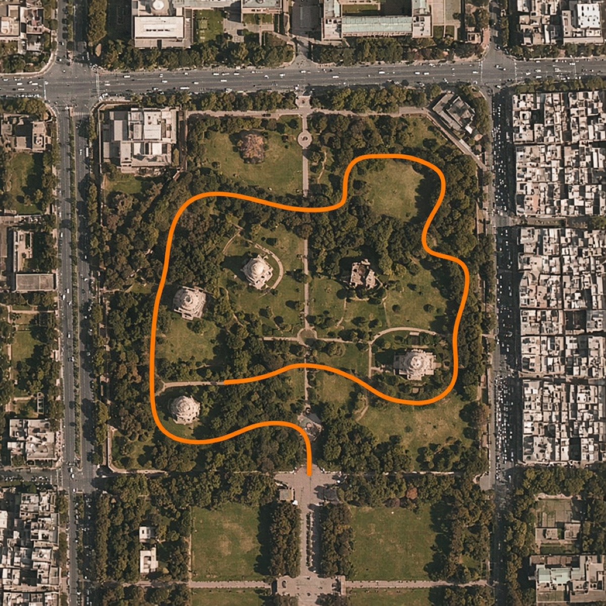
map matching matters most when the gps is 'almost' on the trail. strava's elevation writeup shows this explicitly: a red gps line drifting off a blue trail, and the lookup using the trail. that is not snapping for fun. if you sample elevation at the drifted points you might pick the ridge next to the path, or a building roof in a dem, and invent climb that never happened. so before elevation lookup, the path is pulled toward the road or trail the athlete was actually on.
privacy zones and hidden starts are applied as a mask on the same geometry. the stream can still exist server-side for the owner. what other people see is a trimmed polyline. that trim has to stay consistent with distance and with segment matching, or a hidden home would still leak a start-of-ride k/qom.
elevation, and why gps altitude is thrown away
gps altitude is the weakest number in the file. it is often off by tens of metres. if you sum the positive deltas of raw gps altitude, a flat 10 km run can show 200 m of climb. that is noise integrating into a fake mountain. strava does not want that number on the activity page.
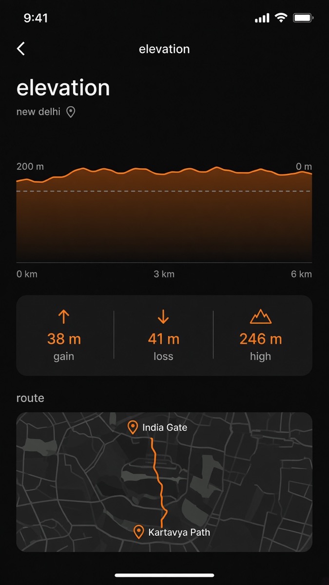
if the device has a barometric altimeter, strava mostly trusts the file. barometers measure pressure, convert to height, and are far stabler over a single activity, though they drift with weather. for fit files, total elevation gain can even come from the device header. if the barometric stream is clearly nonsense, it gets thrown out.
if there is no barometer — and the strava mobile app counts as no barometer — strava looks up elevation for each latlng against its own elevation basemap. that map is not a random public dem anymore. they used to use public databases with uneven resolution. now the lookup is powered by the community: every barometric upload helps build the basemap. your phone run borrows height from the watches that already rode that street.
then they smooth. smoothing is heavier when the source is lookup, lighter when the source is barometric. elevation gain is not 'every up-tick'. there is a threshold so tiny wiggles do not count: on the order of 10 metres of consistent climbing for activities without strong barometric data, and about 2 metres when barometric data is present. only after the climb holds past that gate does it add to total gain. descent is the mirror image. this is why strava, garmin, and your friend's wahoo can all disagree on the same hill. they are not counting the same wiggles.
corrected elevation on the activity page means: we ignored the gps altitude, matched you to a path, sampled the basemap, smoothed, then applied the gain threshold. barometric elevation means: we used the pressure stream in the file, with less smoothing. both are estimates. neither is a theodolite.
the backend after the numbers exist
once streams and metrics are written, the activity is a product object: a row you can fetch, a card in a feed, a map, a set of streams for the charts. that is the mysql-shaped part of strava — activities, athletes, social graph, kudos. the geo part is a different service.
tessa is the scala system strava described for spatiotemporal features: activity grouping, segments, flyby. an activity's space-time stream is cut into tiles and timestamps. a tile is broken into microtiles. a bitmask records which microtiles were touched in each minute. those rows go to cassandra, so 'who else was here, around now' is a lookup, not a scan of a billion gps files.
uploads publish kafka messages. tessa subscribed to an event-activity topic. a storm topology used to turn streams into cassandra rows. they later moved that work toward spark structured streaming: a data stream reader on kafka, a transform from activity streams into tile rows, a writer into cassandra. storm was the old stream engine. spark was the replacement they were aiming at for this path.
segments and leaderboards
a segment is a polyline someone created from an activity. matching means: did this new gps trace traverse that polyline, in order, close enough in space. the tile index is the coarse filter. the fine filter is geometry — distance to the segment, coverage of its length, direction. if it matches, you get an effort: the time between the matched start and end. that time is what the leaderboard stores.
leaderboards used to be a more lock-ish, rpc-shaped system. at their scale, every ride writes many efforts, and each effort is 'this athlete, this segment, this time'. the rebuild they wrote about treats effort mutations as a stream. you do not need a global lock. you only need total order per segment/athlete slot, because an athlete has one best time on a given board. partition the stream by that pair, give each partition one worker, and you can update boards in parallel without two writes stomping the same slot. redis and similar hot stores still show up around the read path. the interesting part is the write path becoming a partitioned log.
the heatmap is the same streams, a different job
the global heatmap is what happens when you stop caring about one athlete and start counting all of them. strava rebuilt it in spark and scala on the stream lake. hundreds of machines, a few hours, a few hundred dollars of compute for a full world pass — after the storage format stopped being one json file per stream.
pipeline, roughly: drop stopped points so traffic lights do not glow hotter than the climb. project latlng into web mercator tiles at zoom 16 (256×256 pixels inside a 2^16 by 2^16 tessellation of the world). split paths on tile edges. rasterize each pair of points as a line, not as a single pixel, using bresenham, because a 1 hz point is often several pixels apart at that zoom and a pointillist heatmap looked dotted and biased toward slow sections. accumulate counts into tile arrays, then store normalized tiles back on s3. trillions of segments. the line-drawing step has to be cheap because it runs that many times.
putting the pieces in order
so a single 'save activity' looks like this. file lands. parser builds streams. outliers drop. distance is device stream, or geodesic sum, or a blend if the track is sick. moving time is the clock minus detected stops. pace and speed are those two numbers divided the right way. elevation is barometer or basemap lookup after a map-match, then a gain threshold. the activity row is written so the feed can show it. kafka tells tessa to tile the trace into cassandra. segment matching emits efforts. effort mutations update leaderboards in partition order. later, spark jobs reuse the same streams for heatmap, gap, and anything else that needs the whole corpus.
there is no one database. there is a file, a queue, a relational activity, a blob of streams, a geo index, a log of mutations, and a lake. each number on the activity page is the output of a filter, not a sensor. gps gives you a cloud of points. strava's job is to decide which cloud is a run.
that is also why these products feel slightly magical and slightly arguable at the same time. the backend is not hiding the truth. it is picking a truth that survives noise, scale, and a two-second budget. once you have seen the pipeline, 10.24 km stops looking like a measurement and starts looking like what it is: a carefully cleaned estimate, computed the same way for a hundred million other people, so the comparison on the segment is at least fair.
illustrative gps maps of new delhi — india gate, kartavya path, lodhi garden. not affiliated with strava.